Table of contents
- Introduction to Data Journalism
- Data investigations
- Daily Data
- Offbeat Data Stories
- Introduction to Web Inspector
- Homework
- Upcoming work
Introduction to Data Journalism
Data journalism is journalism that finds and tells stories with data. Data is just organized information, structured in a way that makes it easy to analyze, to compare, and to visualize, no matter how much of it we have.
While a lot of data journalism is (rightfully) concerned with the tools and technology needed to capture and analyze large quantities of data, the best data journalism is still about telling stories.
When brainstorming data journalism stories, consider two things:
- Why should anyone care about this story?
- Why does data matter for this story?
Data investigations
Cheating our children
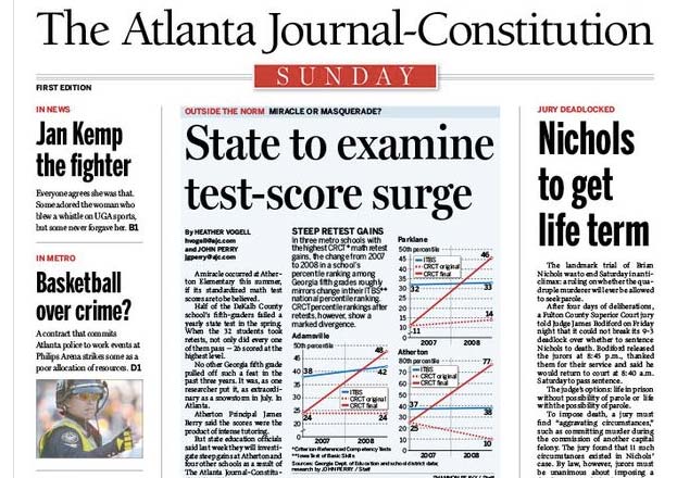
In December 2008, the Atlanta Journal-Constitution examined suspiciously high test scores at five elementary schools. The AJC’s statistical analysis would spur a statewide investigation leading to the indictment of the Atlanta schools superintendent, along with more than 30 other school officials and teachers.
Half of the DeKalb County school’s fifth-graders failed a yearly state test in the spring. When the 32 students took retests, not only did every one of them pass — 26 scored at the highest level.
No other Georgia fifth grade pulled off such a feat in the past three years. It was, as one researcher put it, as extraordinary as a snowstorm in July. In Atlanta.
Why should anyone care about this story? Were Atlanta students really making impressive and needed gains? Or does the system encourage cheating by schools desperate to improve their reputations?
Why does data matter for this story? Teachers and school officials who administer the tests denied any cheating. There needs to be a way to judge whether the test results are realistic, or whether they indicate a pattern of systematic cheating.
Related links:
- Surge in CRCT results raises ‘big red flag’
- Are drastic swings in CRCT scores valid?
- Cheating our children: The story behind the story
- The AJC’s methodology behind suspicious school test scores
Dr. John Snow and the Cholera Outbreak of 1854
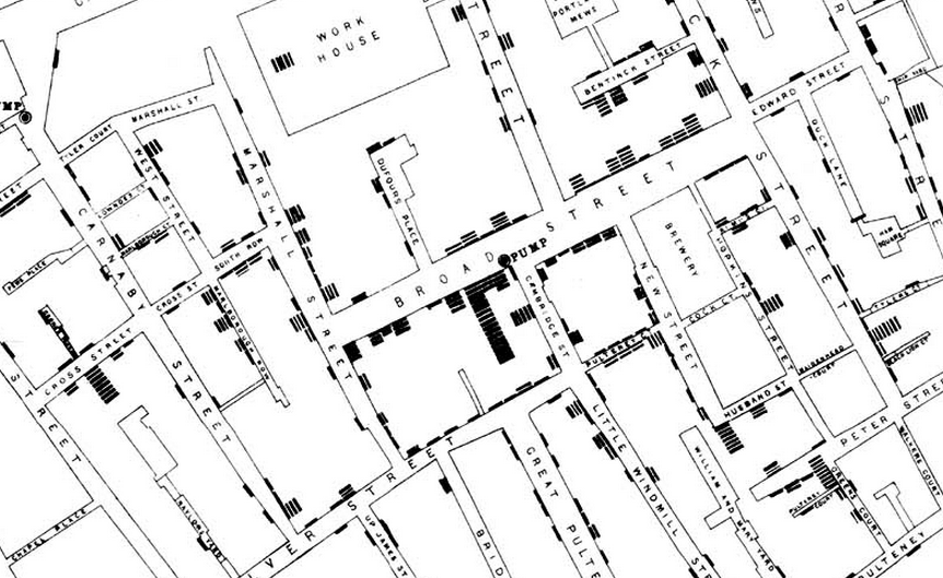
Dr. Snow’s data-gathering on cholera victims and their families and his visualization of the data is considered to be the birth of modern epidemiology.
On proceeding to the spot, I found that nearly all the deaths had taken place within a short distance of the [Broad Street] pump. There were only ten deaths in houses situated decidedly nearer to another street-pump. In five of these cases the families of the deceased persons informed me that they always sent to the pump in Broad Street, as they preferred the water to that of the pumps which were nearer. In three other cases, the deceased were children who went to school near the pump in Broad Street...
Why should anyone care about this story? The cholera outbreak of 1854 killed more than 500 people in less than two weeks, and no one understood the cause of its transmission.
Why does data matter for this story? The reigning epidemiological theory at the time was that disease was spread through foul air. Dr. Snow needed a methodological way to show that the deaths were linked to something else.
Related links:
- John Snow and the Broad Street Pump
- John Snow’s data journalism: the cholera map that changed the world
- Wikipedia article on 1854 cholera outbreak
Speeding cops and their victims
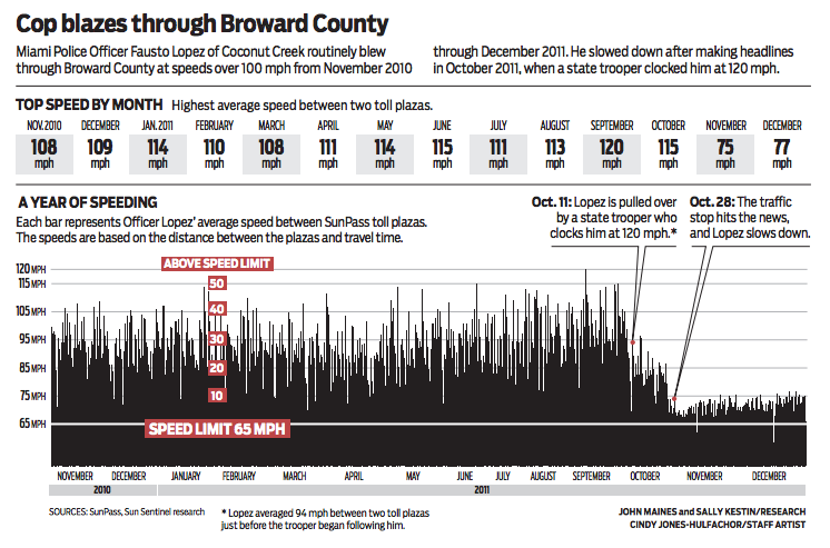
The Sun-Sentinel was awarded the 2013 Pulitzer for Public Service for its investigation into South Florida off-duty cops and their tendency to drive recklessly with impunity.
We’ve all seen it, and now there’s proof: Police officers sworn to uphold our traffic laws are among the worst speeders on South Florida roads.
Why should anyone care about this story? Off-duty cops were flagrantly violating the speed limit, sometimes injuring or killing innocent bystanders.
Why does data matter for this story? Since the cops were the ones who enforced the law and were unlikely to be a reliable source of information on how they break the law, reporters needed a different dataset to prove that speeding was an endemic problem.
Related reading:
- Sun-Sentinel Pulitzer Prize-winning entry
- How the Sun Sentinel reported its Pulitzer Prize winning coverage of off-duty cops
Financial ties between doctors and drug companies
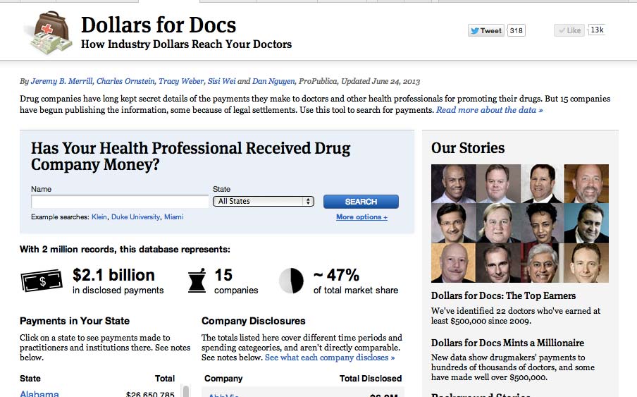
With strict regulations on how drug companies can market their drugs to the doctors who prescribe them, the drug companies found other ways to create financial relationships to physicians.
Payments to doctors for promotional work are not illegal and can be beneficial. Strong relationships between pharmaceutical companies and physicians are critical to developing new and better treatments.
There is much debate, however, about whether paying doctors to market drugs can inappropriately influence what they prescribe. Studies have shown that even small gifts and payments affect physician attitudes. Such issues have become flashpoints in recent years both in courtrooms and in Congress.
Why should anyone care about this story? A drug company’s incentive to sell their drugs may not always be in the best interest of a doctor’s patients.
Why does data matter for this story? Federal and state regulations required drug companies to disclose the records of their financial relationships with doctors.
Related reading:
- Docs on Pharma Payroll Have Blemished Records, Limited Credentials
- Med Schools Flunk at Keeping Faculty Off Pharma Speaking Circuit
- Doctors’ Ties to Drug Makers Are Put on Close View
- Pharmaceutical Company Payments to Physicians: Early Experiences With Disclosure Laws in Vermont and Minnesota
Daily Data
The granular nature of data lends itself to projects that can fit into the daily news cycle while bringing additional valuable context.
Homicide Watch
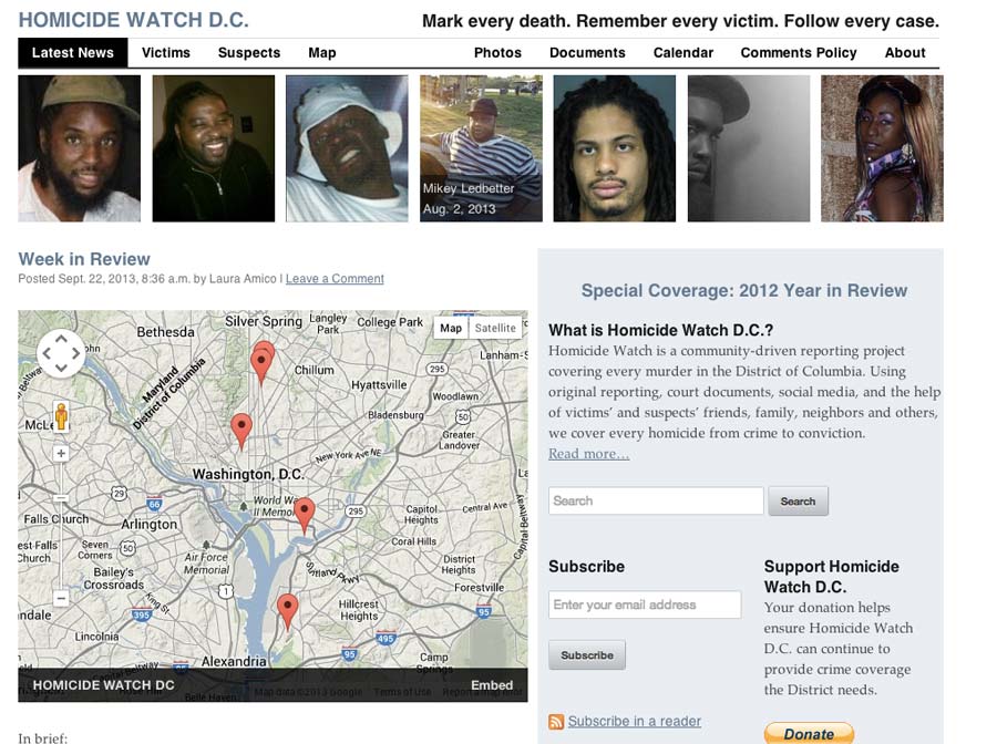
A community-driven reporting project that aims to cover every murder in Washington D.C.
Related reading:
- A place for Homicide Watch: Can a local blog fill some of the gaps in Washington, D.C.’s crime coverage?
- Homicide Watch D.C. uses clues in site search queries to ID homicide victim
FiveThirtyEight - Nate Silver’s Political Calculus
Nate Silver is best known for his uncanny accuracy in predicting the big races, but while he was blogging for the New York Times, he produced a steady stream of writing that brought depth and context to races and polls at every level.
Related reading:
- How did Nate Silver predict the US election?
- Which Polls Fared the Best and Worst in the 2012 Presidential Race?
NYT’s Health Department Restaurant Ratings Map
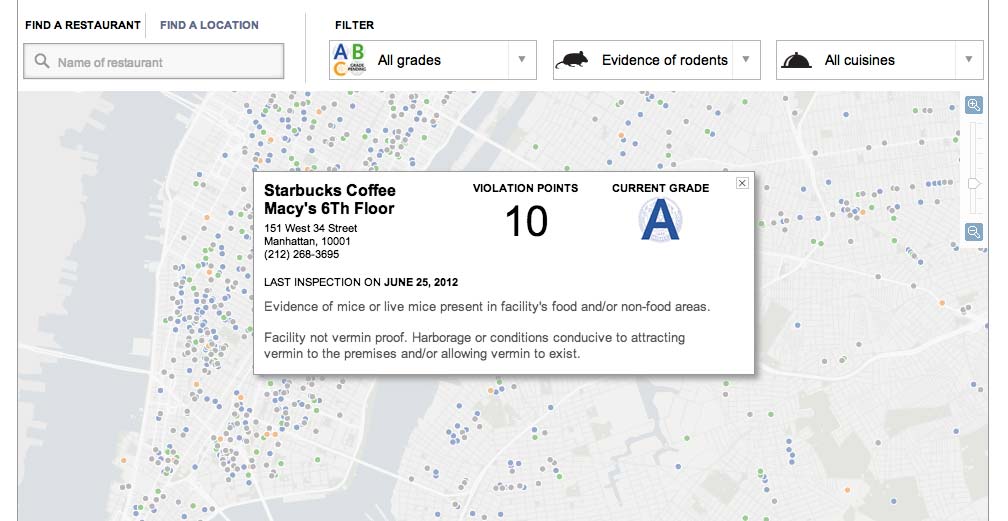
The city of New York already has a website for restaurant health ratings, but the New York Times’s variation shows how much more useful the data can be with the right interface.
Offbeat Data Stories
Data doesn’t mean “dry” journalism.
Cicada Tracker
![]()
WNYC and Radiolab enlisted readers to build hardware sensors to track and map the 17-year “Swarmageddon”
Related reading:
Fashion Fingerprints
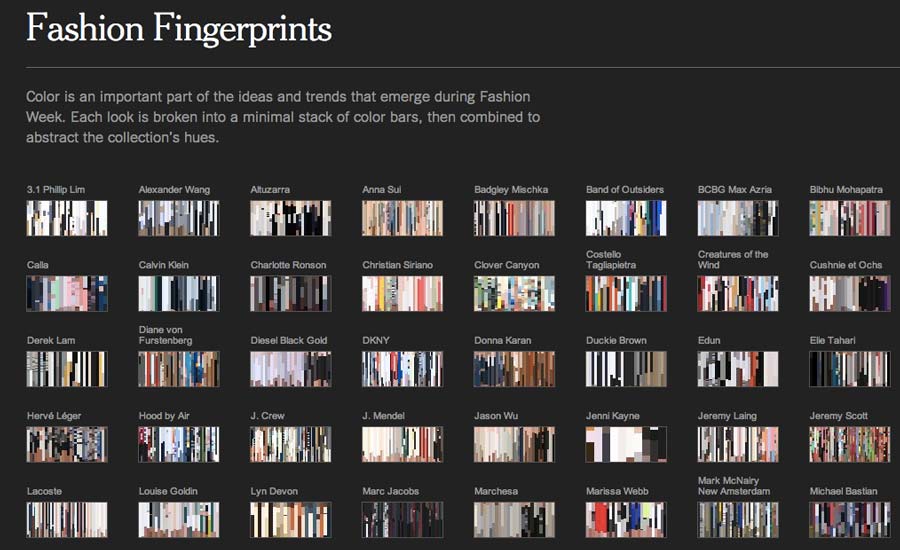
The New York Times brought D3 visualizations and “1-dimensional k-means clustering” to NYFW Spring 2014.
Related reading:
Previously, on Arrested Development
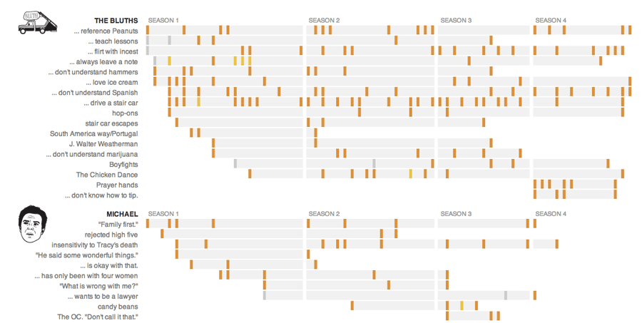
This comprehensive resource to Arrested Development jokes and references is the result of die-hard fan who knows how to use a spreadsheet.
Related reading:
How NPR made its ‘Arrested Development’ graphic: ‘We like to build useful stuff’
Introduction to Web Inspector
The class workshop will focus on using the Web Inspector. Data journalism isn’t necessarily tied to the Web, but the Web will be where we find much of our data and where we will publish our work, so using the Web inspector will get us to a baseline understanding of how the Web and structured data works.
Reference material:
- Inspect the Web with Your Browser’s Web Inspector
- Meet Your Web Inspector
- Reading Data from Flash Sites
Homework
In the homicide map hosted by the New York Times, find the oldest named victim in their listings. (Hint: If you don’t know how to use the web inspector to do this, contact me before searching the interactive manually).
List at least 10 places in New York that are among your favorites to eat and drink at. You can use Microsoft Excel or Google Spreadsheet. Your spreadsheet should have these columns:
- Restaurant name, e.g. Shake Shack
- Street number, eg. 141
- Street name, E. 25th Street
- Building name, e.g. #4 (if applicable)
- Priciness, on a scale of 1-5, eg. 2
- Borough, e.g. Manhattan
- Category, e.g. Burgers
You can use my sample spreadsheet here and make a copy of it
Optional: Read at least two of the series covered in class. Come prepared to talk about the source of the data for the stories and how the data was gathered.
Upcoming work
- How to use Fusion Tables
- Opening a S3 account
- Check out the NYC Socrata website for interesting datasets