Today is the last in-person class for the NYU-SCPS Fall 2013 data journalism course. Hope you enjoyed it so far. We’ll be going over more visualization theory in-class, plus a demonstration of Open Refine as one more tool in your data-wrangling skillset.
Class business
Three important things for today and beyond:
- You should have received an email to perform an online evaluation of this course. You can do so at this link. Students who complete the evaluations are eligible for one of four $500 book scholarships at the NYU Bookstores
- The take-home final can be found here. It is due next week, on Monday, November 4
- The take-home project is due on November 20. The requirements and description can be found here.
Table of contents
Killer Visualizations
...Information is not the scarce resource. Attention is.
Last week I said that one of the first questions to ask before creating a visualization was: does the visualization tell the story in a way that words can’t?
A clearer way of stating that sentiment might be: Will your visualization kill someone?
Not intentionally, of course. But in your rush to make an elaborate, beautiful picture out of the data, keep in mind that the visual should be clarifying the data, not decorating the data for the sake of decoration (i.e. “Tables are boring, let’s make a 3D pie chart!”).
But that distinction can be a little abstract. So before applying a visualization technique, ask yourself: would I use this to describe something that my life depended on &ndash in an emergency?
Flight-deck confusion overload
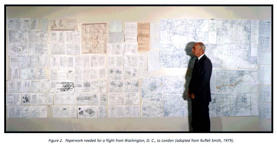
In 1992, NASA commissioned a study of checklist safety. Among the sub-topics covered were the typography used in flight manuals and checklists.
Ruffell Smith (1979), reported that excluding aircraft flight manu- als, the amount of paperwork needed for a flight from Washington D.C. via New York to London, had a single side area of 200 square feet
Figure 22. The combined effect of several sub-optimal typographical conditions.
The typeface on the Air New Orleans’ checklist is 57 percent smaller than that recommended by human engineering criteria. This smaller typeface reduces the legibility of print even under optimum conditions. Although there was no evidence that checklist legibility was a factor in this accident, the Safety Board believes that under other operational circumstances, this deficiency could compromise the intended purpose of this device. Therefore, the Safety Board believes the FAA should take action to verify that aircraft checklists are designed to comply with accepted human engineering criteria (p. 22).
The 25 pound flight bag I carry contains 5 volumes of information in a constant state of revision. Too much information could cause important items to be overlooked–lost in the maze of print. Important items of informa- tion and procedures should be concise and printed as to be easy to read–especially at night. (ASRS Report No. 157620)
PowerPoint and the Shuttle Disaster
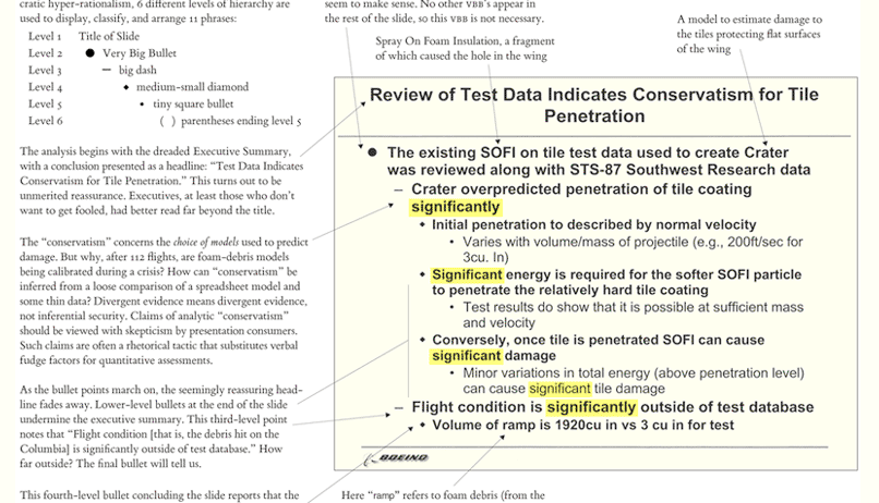
In addition to his groundbreaking work in data visualizations, Edward Tufte is well-known for his evisceration of PowerPoint. He even sells a $2 pamphlet for those who don’t want his book but need to know what’s wrong with PowerPoint.
PowerPoint Does Rocket Science–and Better Techniques for Technical Reports
In the reports, every single text-slide uses bullet-outlines with 4 to 6 levels of hierarchy. Then another multi-level list, another bureaucracy of bullets, starts afresh for a new slide.
How is it that each elaborate architecture of thought fits exactly on one slide? The rigid slide-by-slide hierarchies, indifferent to content, slice and dice the evidence into arbitrary compartments, producing an anti-narrative with choppy continuity.
It’s not really PowerPoint itself that’s the problem. However, Tufte pessimistically notes:
The record for incremental reform in the cognitive style of PowerPoint is not promising. In the many release versions of PP, the intellectual level has not been raised. New releases have drifted toward ingrown self-parody, featuring ever more elaborated PP Phluff and presenter therapy. These changes have made the new version different from the previous version, but not smarter. There are no incentives for meaningful change in a monopoly product with an 86% gross profit margin, only incentives to make it different, somehow, from the previous release. PP competes only with itself.
Color and symbolism
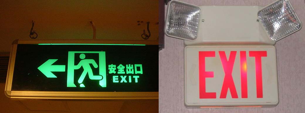
The Big Red Word vs. the Little Green Man
Green is the color of safety, a color that means go the world over. Red, on the other hand, most often means danger, alert, halt, please don't touch. Why confuse panicked evacuees with a sign that means right this way in a color that means stop? International designers tend to think our system is illogical and consider our rejection of the running man to be as dumb as our refusal to adopt that other sensible international norm, the metric system.
Skewed scales
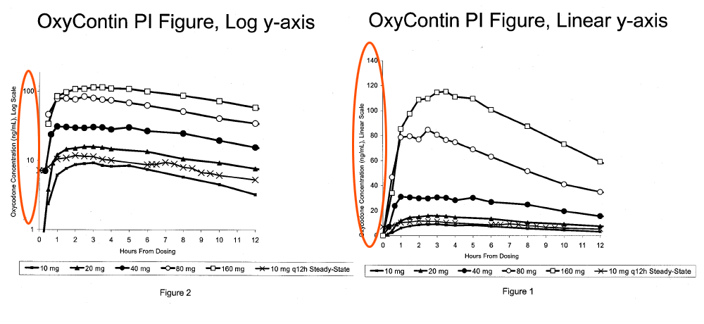
How Purdue Used Misleading Charts to Hide OxyContin’s Addictive Power - CBS News, Sept. 28, 2011
A case filed by the Commonwealth of Kentucky against Purdue Pharma sheds new light on the origin of an infamously misleading chart showing that OxyContin stays in patients’ blood levels over time, when in fact levels of the drug drop off sharply in users, triggering withdrawal symptoms and addiction. The chart was later used by Purdue as a marketing tool to convince doctors that OxyContin was less addictive than it actually was, the case claims.
War and PowerPoint
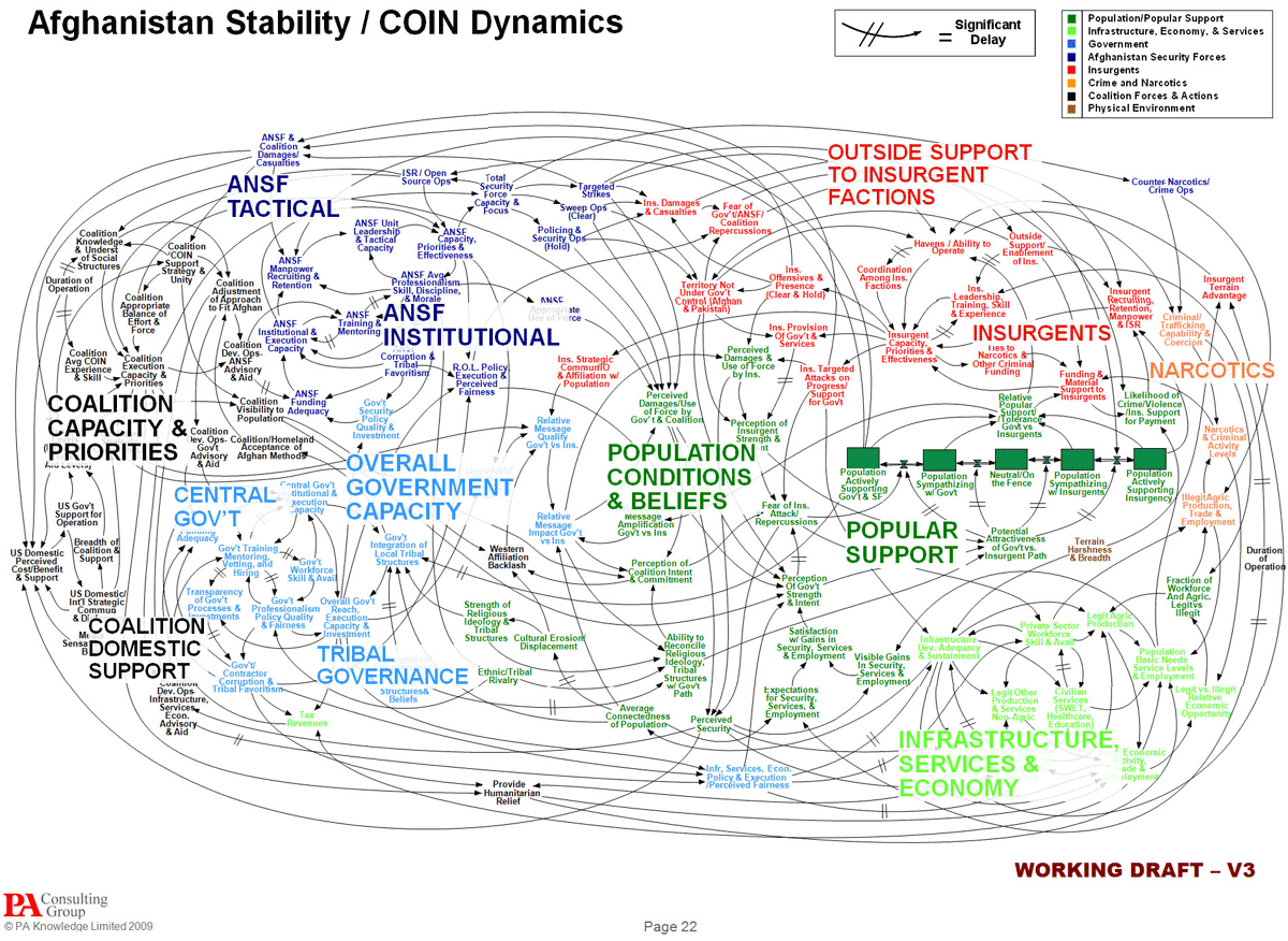
We Have Met the Enemy and He Is PowerPoint
Gen. Stanley A. McChrystal, the leader of American and NATO forces in Afghanistan, was shown a PowerPoint slide in Kabul last summer that was meant to portray the complexity of American military strategy, but looked more like a bowl of spaghetti.
“When we understand that slide, we’ll have won the war,” General McChrystal dryly remarked, one of his advisers recalled, as the room erupted in laughter.
“It’s dangerous because it can create the illusion of understanding and the illusion of control,” General McMaster said in a telephone interview afterward. “Some problems in the world are not bulletizable.
Simplifying visuals
Simplifying a visualization is not done only out of aesthetic concern, but in recognition that raw data does not just automatically fit into a visual format. The decisions we make at the visual level often impact the data we end up using in the visualization.
In the following exercise, we’ll go through the step-by-step process of simplifying it, even though it starts out as a very simple chart. In fact, it’s the charts with the least data that become overloaded with visual distraction to compensate for their shallowness of insight.
Transforming the pie chart
Pie charts are a common way to show the parts of a whole. However, the human eye is not particularly great at judging circular areas. As Stephen Few told the New York Times:
When looking at parts of a whole, the primary task is to rank them to see the relative performance of the parts. That can’t be done easily when relying on angles formed by a slice.
The misjudgment gets even worse when the pie is rendered in 3D. From the Wikipedia page on “Misleading graph”:
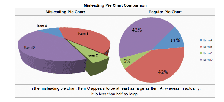
Edward Tufte who is also famously anti-pie has this to say:
Tables are preferable to graphics for many small data sets. A table is nearly always better than a dumb pie chart; the only thing worse than a pie chart is several of them, for then the viewer is asked to compare quantities located in spatial disarray both within and between pies - Given their low data-density and failure to order numbers along a visual dimension, pie charts should never be used
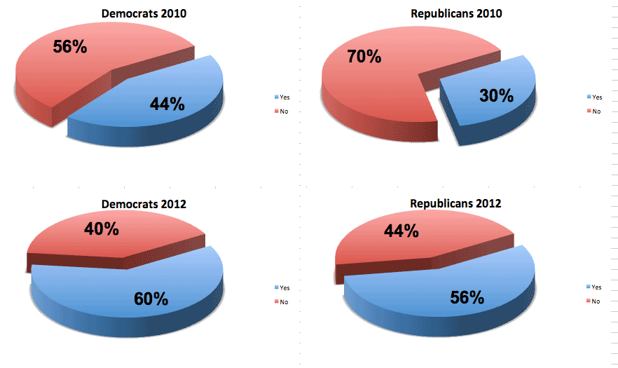
So we’ll start with a chart that would be captivating in your standard white-collar PowerPoint presentation, but contains the Tufte anti-pattern of “spatial disarray” and “low data-density.” And then we’ll simplify and clarify it through a few steps.
The starting pie
The chart at hand ostensibly compares the changes in attitudes on a given question, among Republicans and Democrats and for the years 2010 and 2012. The actual question doesn’t really matter, but let’s pretend that it is: “Do you believe that bacon should be its own food group?”
For the sake of brevity, just imagine that all of the graphics that follow have that chart title:
Do you believe that bacon should be its own required food group?
Kill the legend
Each pie only has two “pieces”, so it doesn’t seem necessary to have a legend to distinguish between the choices. We definitely do need to repeat it four times, once for each chart.
But even if the pies contained more than a couple pieces, the legend as placed in our graphic requires too much eye movement from the pie to the legend to easily connect the two. When possible, use labels on the actual data points; use a legend if things get too cluttered.
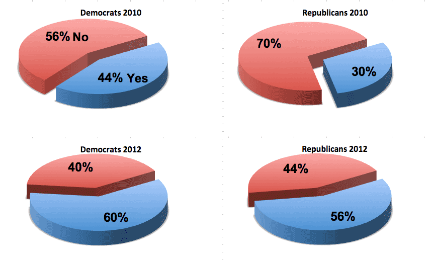
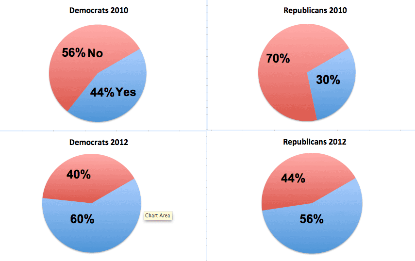
In our example, I’ve added Yes and No to the first pie chart. Since the four charts are grouped together and have the same visual pattern, the reader should only need to be acquainted with the Yes/No association in that first chart.
Go to 2D
3D is a nice wow-ee effect, and let’s face it, if the choice is between visual clarity and impressing the middle managers with flair, adding a little 3D adds some real complexity to what is otherwise a data-empty chart.
But in situations where accurate comparisons are important, skip the 3D. The human eye already has enough problems judging angles and proportions in 2D.
As you can see in the graph below, the 2D pie charts also use a lot less “ink” to show what is basically 2 datapoints per pie.
Simplify the color
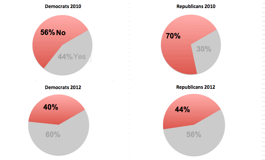
We only have two colors per pie, but the colors here are problematic. While red often does mean No, in U.S. politics, it also stands for Republican. Conversely, blue stands for Democrats. Even though the data points here are few, the cognitive work needed to disassociate red from its “Republican” meaning makes the comparison difficult. Many readers will have to check the chart sub-titles to remind themselves which party they’re looking at.
The easy choice here is to make one of the colors neutral. Let’s take the editorial stance that not wanting bacon to be its own food group is the interesting thing. So we leave in the red to stand in for No and remove the blue:
Remove the redundant number
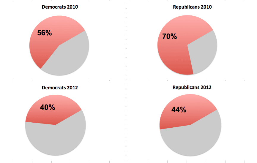
As stated above, we care more about the number of people who disagree with bacon being its own food group. Given that our pies only have Yes and No, the value for No automatically implies what the value of Yes will be (e.g. 100 - 54 = 46).
So why even waste ink on labeling the Yes percentage, especially if the No percentage is more important to us?
No more pies
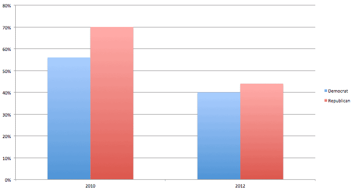
After removing the Yeses above, the number of actual datapoints in our chart is 4. We’re essentially devoting an entire pie per single datapoint.
Seems like a waste of ink. That, plus the argument that pie charts are harder to accurately judge compared to bar charts, should be enough to get us to move to bar charts.
Now that we’ve reduced the data to its bare minimum – the percentage of each political party that says No to bacon, we can make changes to the graph style. I’ve chosen to bring back blue here to represent the Democrats. I’ve clustered the bars by year, to better show each party’s proportion to the other for that year.
You could also cluster the values by party, so that the 2010 and 2012 values are clustered together for each party. That has a slightly different angle: you’re implying that the change across years is more important than the differences in party attitude. Either way works, depending on the topic.
Even less ink
In this final example, I’ve removed the grid lines and switched the bars to a horizontal layout. The horizontal layout isn’t necessary, it just fits my page better.
The grid lines, however, don’t need to be there. Again, we have so few data points that it’s just easier to label each bar. Grid lines count as “ink”, too, and are eligible for removal if they don’t clarify your picture.
