Table of contents
- John Snow’s Cholera Map
- When maps shouldn’t be maps
- Workshop: Fusion Tables and NYC School Data
- Keep it simple
Just because you have data doesn’t mean that you should make a visualization. So when does the data warrant a visualization? The first question to ask yourself is:
Does the data tell an interesting story?
If you weren’t able to draw any kind of visualization, is there anything in the data worth telling someone about? In other words, don’t compensate for a boring story with a overwrought attempt at visualization.
The next thing to consider: Will a visualization tell the story in a way that words can’t? Visualizations shouldn’t be seen as ways to break up the text in a long report. They should at the very least, clarify the data.
John Snow’s Cholera Map
John Snow’s cholera map is rightfully one of the most celebrated examples of data visualizations, not least of which because it’s associated with the birth of modern epidemiology.
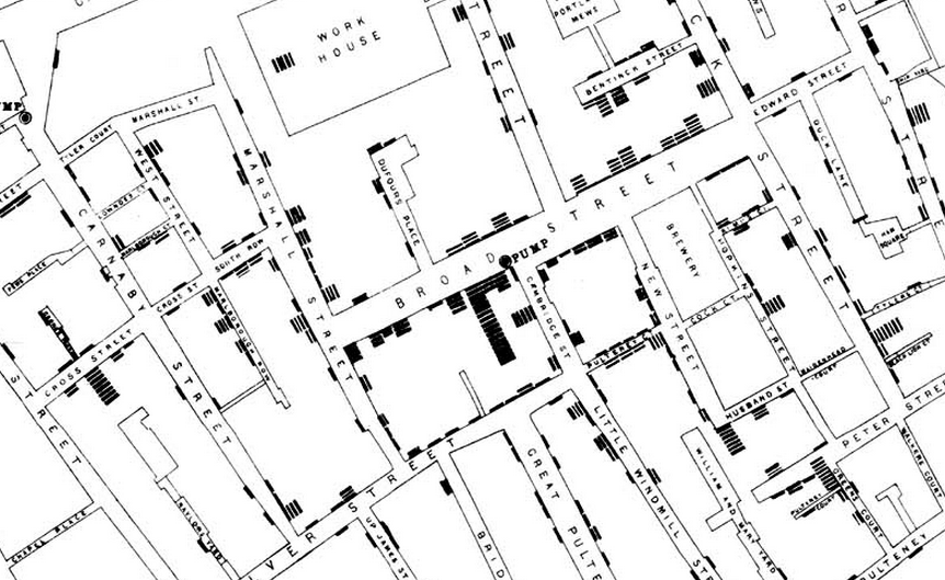
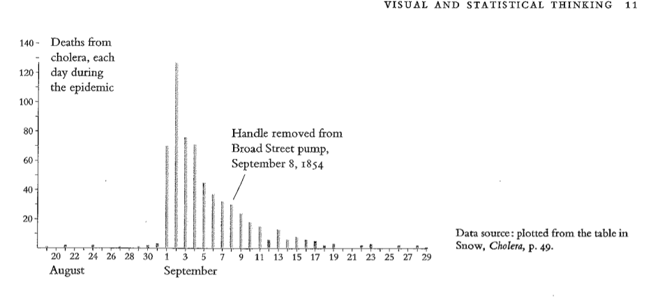
Instead of plotting a time-series, which would simply report each day's bad news, Snow constructed a graphical display that provided direct and powerful testimony about a possible cause-effect relationship
As Edward Tufte demonstrates, there were plenty of ways to badly plot this data:
The use of the Voronoi diagram
However, author Steven Johnson argues that the dot map was not itself a breakthrough, as dot maps had been used before to map disease. More importantly, the map did not counter the competing theories for cholera’s spread:
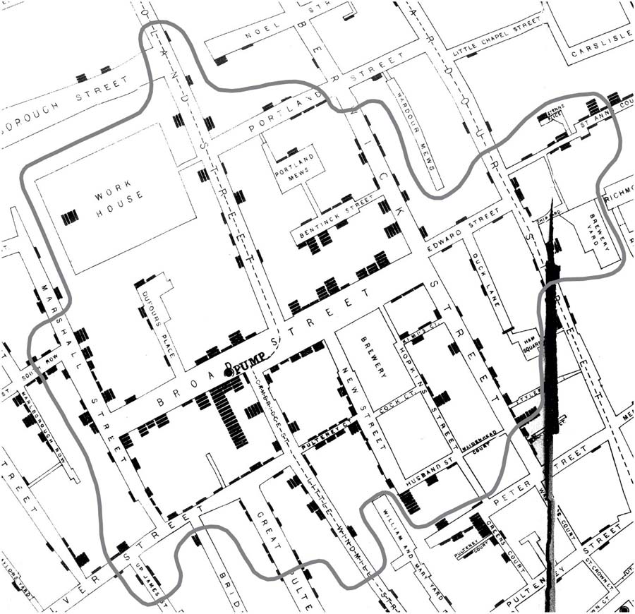
After presenting to the Epidemiological Society, Snow had realized that his original map was still vulnerable to a miasmatic interpretation. Perhaps the concentration of deaths around the Broad Street pump was merely evidence that the pump was releasing noxious fumes into the air. And so Snow realized he needed a way to represent graphically the foot-traffic activity around the pump that he had so painstakingly reconstructed. He needed to show lives, not just deaths; he needed to show the way the neighborhood was actually traversed by its residents.
The second version of Snow’s map below, via the John Snow archive, denotes the boundary between areas closer to the Broad Street pump versus to the surrounding pumps. This kind of visualization is referred to as a Voronoi diagram, though it was formally named afterwards for the mathematician Georgy Fedosievych Voronyi.
When maps shouldn’t be maps
Because of their general role in helping us locate where we are in relation to, well, anything, maps have a universal appeal and familiarity. However, they are not always the best ways to show data. Even John Snow’s elegant dot map, without additional data and research, could mislead readers into supporting a “miasamatic” theory.
From Matt Ericson’s classic essay on modern news maps:
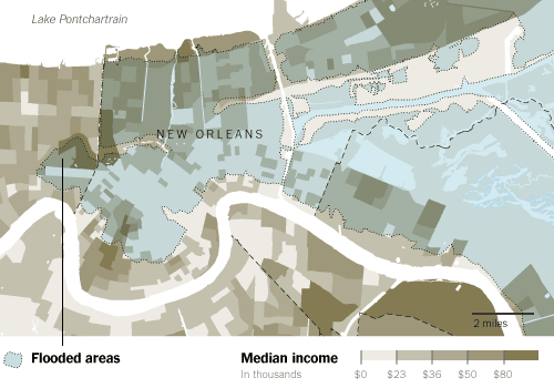
But while maps like [the above] are interesting to look at, it also forces readers who want to figure out the correlation between income and flooding to try and visually sum up all the colors on the map in their head. The map shows there’s low-income areas in the flooded areas and there’s also low-income areas outside the flooded areas. There’s middle- and upper-income areas in each, too. Unless the pattern is super clearcut, trying to figure out how much of a relationship exists is a tricky task.
Alternatives to mapping
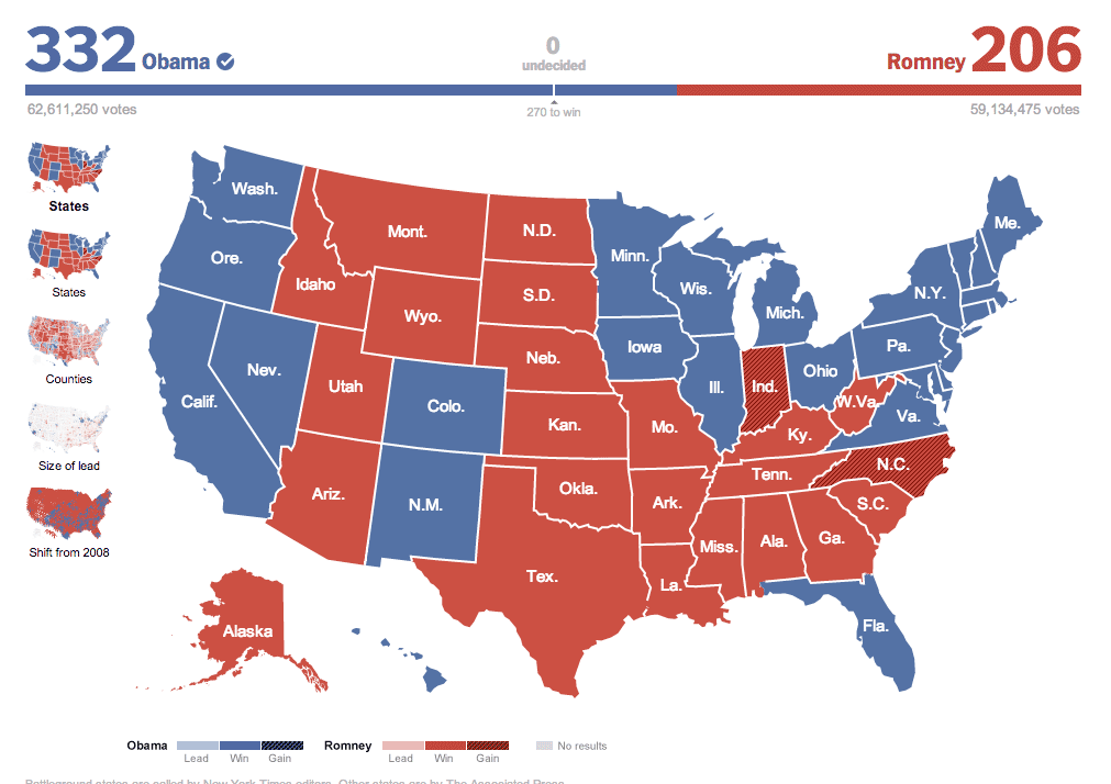
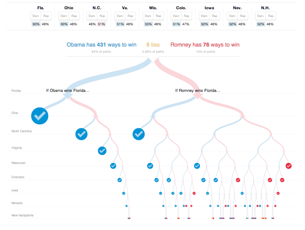
Because the representation of each state is the same size, this chart doesn’t make the point spread obvious. However, it does show through horizontal position how Obama won where it counted (in the tossup states)
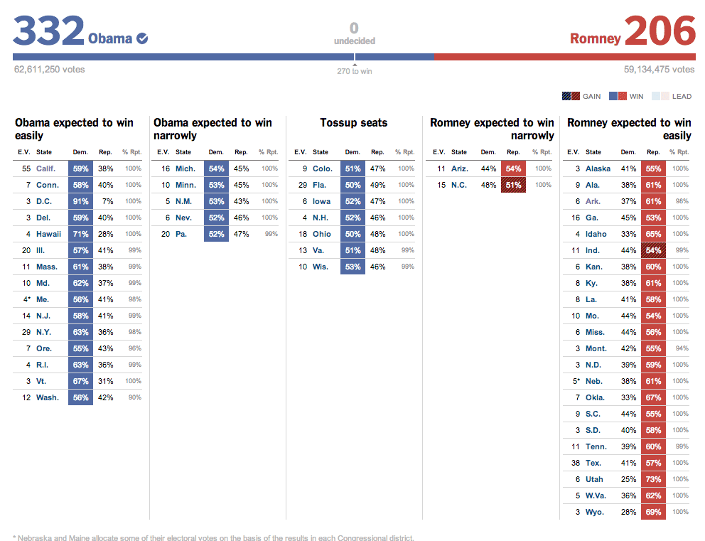
A great example of how an infographic can bring clarity to data that words can’t. Without any interaction, this NYT diagram of election outcomes immediately informs the viewer of which states are at stake and makes a clear implication for how lopsided the election odds are, when considering the U.S. electoral system. When you actually interact with the graphic to test out scenarios, a new dimension is shown: how narrow Romney’s chances are if he loses any of the battleground states.
In class examples
Class break. Go over these examples:
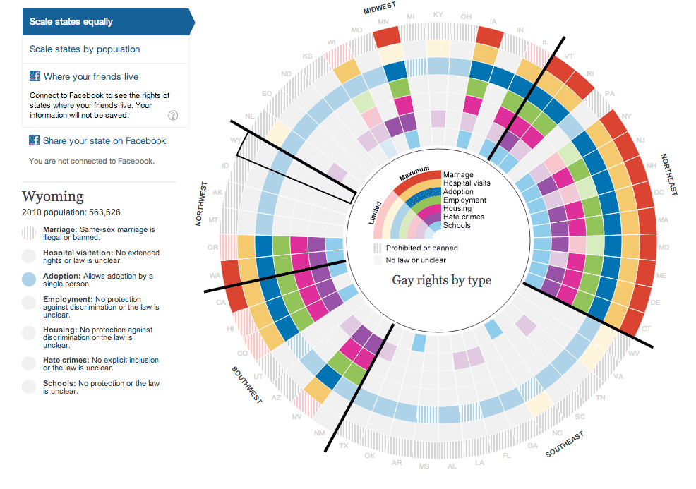
Gay rights in the US, state by state, by The Guardian
This is a compact way to show roughly 350 data points in one screen. The radial design is not as easy to interpret as a typical bar chart, but it does allow for the clever positioning of each region (the southeast is in the lower-right of the circle). It’s hard to imagine how the many “levels” of rights could be represented in an ordinary U.S. map of the states.
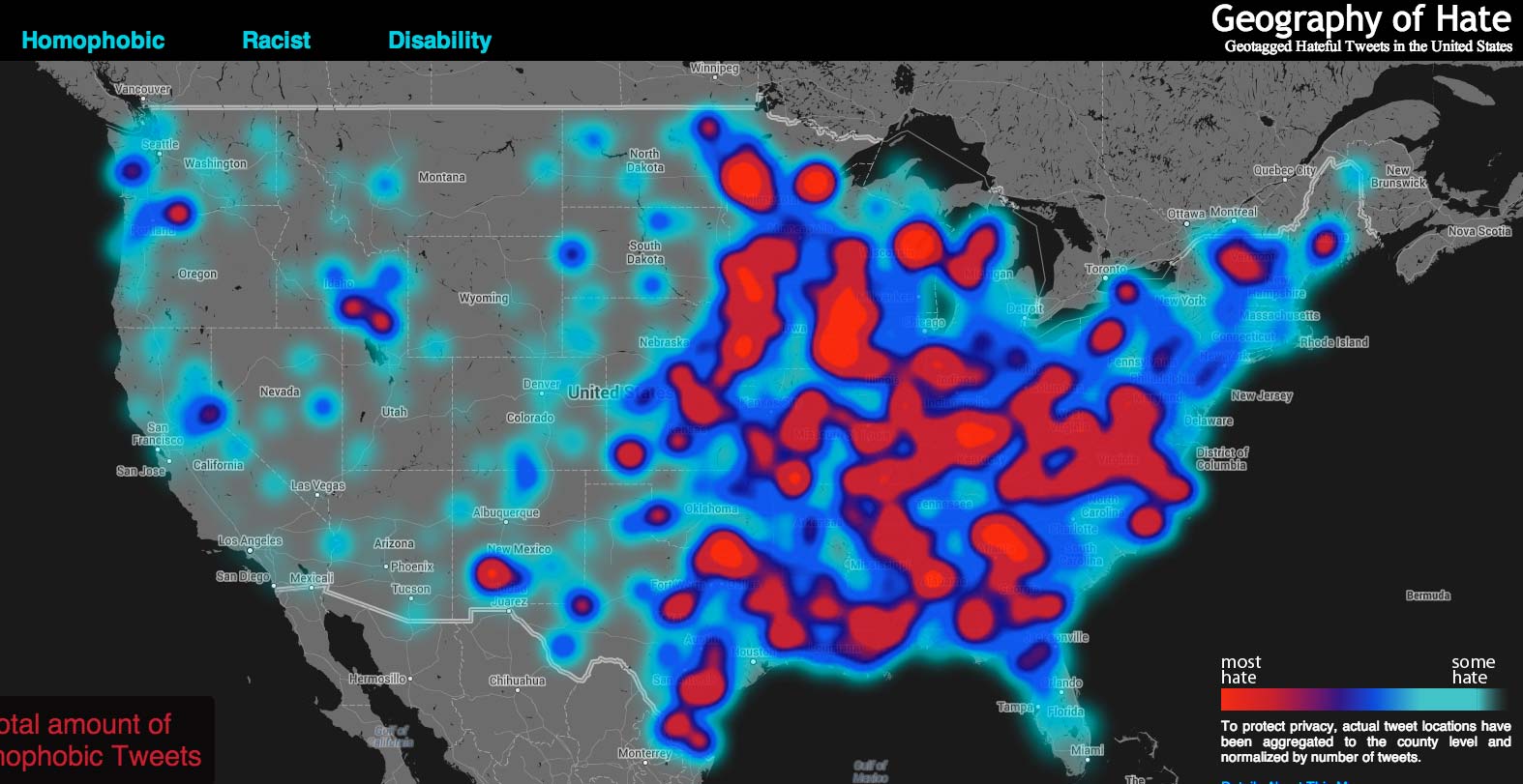
Hate Map, via Humboldt University
Technical problems mar this map (try zooming out to the nationwide view), which is already suspect because of its very selective sample group.
Workshop: Fusion Tables and NYC School Data
This is a review of how to use Google Spreadsheets and Fusion Tables to organize and visualize data. The process is virtually the same as the one outlined in my indepth walkthrough
Make two Fusion Tables
- Import the three Fusion Tables (School Locations, SAT 2010, SAT 2012, and School Locations)
- Merge 2012 to 2010 SAT tables on the
DBNfield - Download as CSV
Make new data in Spreadsheets
- Upload as CSV to Spreadsheets
- Sort and delete the
sand blank values - Make four new columns
- 2010 - 2012 Test Takers:
=H2-C2 - Conditional Formatting
- Make a
codecolumn out of theDBN:=RIGHT(A2,4) - Download as CSV
Back into Fusion tables for mapping
- Upload the merged 2010-2012 SAT CSV into Fusion Tables
- Merge the SAT table with the School Locations table
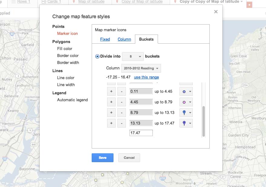
- Create a map that uses
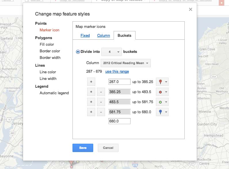
latitudeandlongitude - Play with the Change map styles option. How does the perception of the data change as you base the markers off of different columns (e.g. reading scores vs math scores)?
- How does the perception change as you alter the colors and the size of the buckets?
The final dataset (which has a few aberrations) can be found here (the 2010-2012 columns in this set show percentages, rather than absolute differences).
Impact of map colors and markers
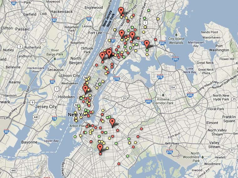
The NYC SAT scores dataset is an example of what should not be a map. It also serves as an easy example of poor selection of markers and thresholds can even further distort the data.
How you divide of the buckets (the thresholds for each level) and the range of colors can greatly impact the map.
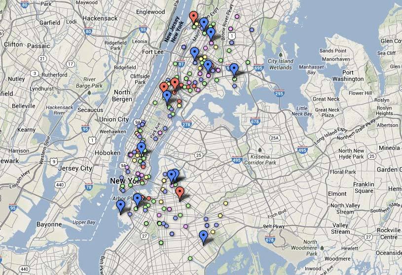
First, let’s look at the SAT Reading scores and map by how much they changed from 2010 to 2012. According to the Fusion Tables summary, the range of change goes from -17.25% to 16.47%
If we divide this into 8 different buckets:
We get a paintball mess of colors:
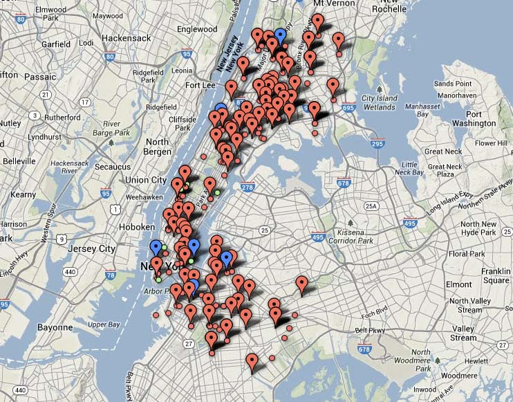
The other extreme is to divide the data into two buckets: red for anything 0 or negative, green for all positive change:
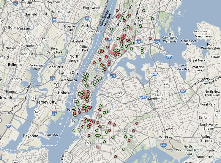
The lack of different buckets obscures the difference between a 1% improvement and a 15% improvement.
Here’s the data in four different buckets; there’s more variety, but no more real insight without additional geographical data (such as Census socioeconomic data):
And is mapping the percentage of change even the right approach? A school that averaged 100 points in 2010 and improved to 150 points in 2012 would boast an improvement of 50%. Yet a score of 150, in absolute terms, is nothing to brag about.
Here’s the absolute reading scores for 2012, divided into these four buckets:
Under these thresholds, the SAT reading performance looks less impressive:
The point: despite how computers have made it easy to make maps, there are many ways that maps can obscure or distort the data.
Related reading
Keep it simple
Like any other form of journalism, visualizations are not better simply because they are bigger or more complex.
Small multiples
Edward Tufte popularized the concept of a “small multiples” chart as a way to make clean visual comparisons across multivariate data:
At the heart of quantitative reasoning is a single question: Compared to what? Small multiple designs, multivariate and data bountiful, answer directly by visually enforcing comparisons of changes, of the differences among objects, of the scope of alternatives. For a wide range of problems in data presentation, small multiples are the best design solution.
One of my favorite examples that Tufte cites is this crude but criminally effective chart of crimes:
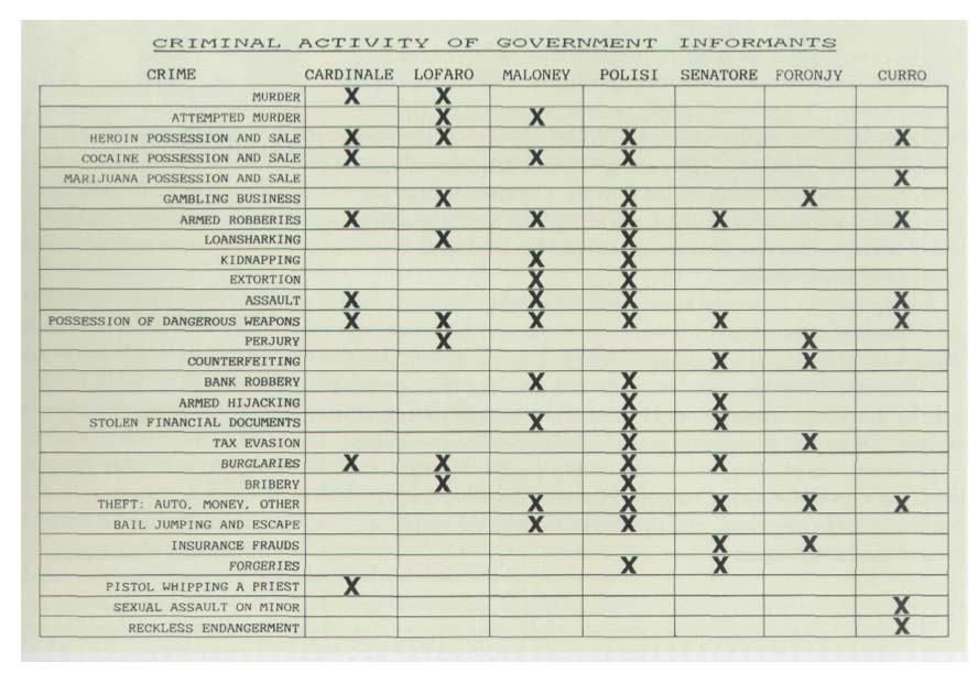
A WEAKNESS IN GOTTI CASE; Major U.S. Witnesses Viewed as Unreliable
Many lawyers and prosecutors who followed events in the seven-month trial of John Gotti said the underlying weakness of the prosecution’s case was its apparent reliance on turncoat career criminals as key witnesses against Mr. Gotti and six co-defendants. A signal that the credibility of the prosecution’s principal witnesses was in doubt came yesterday morning when the jury, in its final request before acquitting the defendants of all charges, reviewed an exhibit introduced by the defense. It was a chart listing the lengthy criminal records of seven prosecution witnesses who had obtained promises of leniency and other favors from the Government in return for their testimony against Mr. Gotti. Admitted Lies in the Past
Fancy tables
Don’t discount the humble table as a visualization. This NYT chart of Tour de France cheaters, in its static form, can be thought of as a spreadsheet with images in each cell:
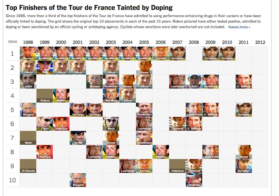
Top Finishers of the Tour de France Tainted by Doping
Driving is Why You’re Fat - GOOD
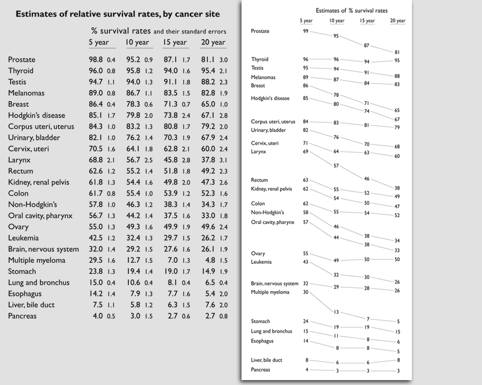
Slopegraph
Again, via Edward Tufte – the slopegraph on the right has fewer data points than table on the left, because it encodes the change between time periods with connecting lines, which more clearly convey the rate of change between data points:
Readings
So far, we’ve been making a lot of maps from data, even though maps aren’t a great way to visualize the data we’ve been looking at. The interactive maps generated by Fusion Tables represent one end of the complexity spectrum – after properly organizing our data, we can generate interactive maps with relative ease.
If we can make maps from our spreadsheets, then you can assume that it’s possible to make a great variety of less-complicated visualizations. In the next class, we’ll go over how to make compelling (non-map) visualizations with a limited toolset.
Read the following articles for next week:
- Common Static Visualization Types
- Megan Jaegerman’s brilliant news graphics
- Good Ol’ Excel Is The Ultimate Data Visualization Tool (In Most Cases)
- Using Small Multiples to get to ‘Aha!
- How the Rainbow Map misleads (i.e. keep your range of colors small)
- The Gettysburg Powerpoint Presentation
- Word clouds considered harmful
- Style and Substance: Analyzing a Beach Ball Chart
More readings:
- We Have Met the Enemy and He Is PowerPoint via the New York Times.
- PowerPoint does Rocket Science - and Better Techniques for Technical Reports via Edward Tufte.
- Visual Literacy in an Age of Data via Source.
- Charts and Things via the NYT’s Kevin Quealy.
- The perils of polling Twitter
- Oscar Predictions, Election Style
- Know your Stats
Also, check out the other articles about visualization that I’ve listed on this site’s Readings page.