Note: the majority of the Fusion Tables and Spreadsheet steps we covered in this lecture can be found in my step-by-step walkthrough on using Fusion Tables to mash and map data.
Table of contents
Data Links
Links for the datasets used in this class
Homicides data, 2007-2008
Data from the NYT’s homicide story from 2008
Restaurants data
Data from the NYC Restaurant Inspection data and from the class crowd-sourced list of favorite restaurants.
- Class favorite restaurants, spreadsheet
- NYCDOH Restaurant Inspections (within class), Fusion Table
- NYCDOH Restaurant Violations (within class), Fusion Table
- NYCDOH Violation codes, Fusion Table
- NYCDOH Restaurant listings, spreadsheet
- NYCDOH Restaurant Inspections (all), Fusion Table
- NYCDOH Restaurant Violations (all), Fusion Table
NPR and NYT Bestselling Books
The lists of bestselling books comes from NPR’s bestsellers website and NYT’s bestsellers API from 2011 to October 2013.
- NYT Bestsellers data, Fusion Table
- NPR Bestsellers data, Fusion Table
- ISBN lookup table from NYT data, Fusion Table
School data
This is performance data from the New York schools department. The homework for next week includes making a mashup from these tables (and any others you may find):
- Information about each school building and classification
- 2012 SAT Scores
- 2010 SAT Scores
- Graduation rates
- School Progress Reports
Useful NYC school data links:
- Test results
- Progress Report Citywide Results
- School surveys
- Graduation Cohorts of 2001 through 2008 (Classes of 2005 through 2012)
Class discussion
Selection and survivor bias
Discuss:

A Rating With a High Return: NC-17 from the New York Times Economix blog.

Tesla’s response to Model S fire
The nationwide driving statistics make this very clear: there are 150,000 car fires per year according to the National Fire Protection Association, and Americans drive about 3 trillion miles per year according to the Department of Transportation. That equates to 1 vehicle fire for every 20 million miles driven, compared to 1 fire in over 100 million miles for Tesla. This means you are 5 times more likely to experience a fire in a conventional gasoline car than a Tesla!
Questions to ask
- Out of how many?
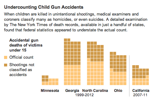
Discuss last week’s homework, the article Children and Guns: The Hidden Toll, by Michael Luo and Mike McIntire, Sept. 28, 2013.
Data-mashing techniques
Merging
The easiest way to make data interesting is to merge (or “join”) two different kinds of datasets using a foreign key.
For example, given a table of state unemployment rates with state_name (e.g. “Iowa”), year, and unemployment_rate, and another table consisting of U.S. Senators, with name, state_name, and party, you could create a merged table showing the unemployment rate of each respective Senator.
The foreign key that joins the two tables would be state_name
Key creation
Sometimes the keys to join tables are obvious and ready made. Sometimes you have to make them yourself.
For example, consider a table of Olympic medals containing these fields:
- Type of medal (e.g. gold, silver)
- Year
- Event
And another table consisting of Olympic athletes:
- Athlete name
- Year participated
- Event
You could join the two tables by combining their respective year and event fields into one, e.g. 2008-100m-sprint
Filtering
All of the data tools we use allow us to hide/show data based on certain criteria. For example, given a list of homicides from 2004 to 2012, we may want to just see the homicides that occurred from 2006 to 2007. Or just the homicides involving victims younger than 18. Or a combination of filters: homicides from 2006-07 in which the victims were younger than 18.
Summarizing
The best kind of data is flat, granular data, such as the restaurant inspection scores for restaurants over the year:
Name     Score  Date
BurgerTown  30  2013-01-10
BurgerTown  20  2012-01-10
ShakeShed   0   2013-02-10
ShakeShed   45  2012-02-10
But sometimes it’s useful to summarize the data by a column (or set of columns.) If we summarize by the Name column, which in effect groups all of “BurgerTown’s” reports together, we can find an average:
Name  Average_score
BurgerTown  25
ShakeShed   22.5
Or display the maximum:
Name  Maximum_score
BurgerTown  30
ShakeShed   45
What we lose in detail – the score of each report – might be offset by the big picture data we get.
Making combinations
All of the techniques above can be mixed and matched. Let’s say we have a table of restaurants, which contains information about that restaurant, including where it is located and its category (e.g. French, Chinese, Sushi) and we have another table of inspections, consisting of restaurant names, dates of inspection, and numerical scores for each inspection.
An example data-mashing would be:
- Merge the two tables via
restaurant name - Summarize the tables by grouping by
categoryto see the average score for eachcategoryof restaurant - Filter the merged table by
inspection date, to see how average score changed, percategory, from one year to the next. - Map the restaurant data (which is really a type of merge – you’re merging table data with map data) , using colored markers to indicate how big of an increase/decrease in inspection
scoreoccurred at each location (e.g. red for a huge decrease in score from 2010 to 2013, green for a huge increase)
Tools
We will be using two tools: spreadsheets (Excel or Google Docs) and Fusion Tables, which is a good stand-in for more complicated relational-databases. Why are we using these? Because they happen to be the easiest, click-friendly tools.
Here’s a quick overview of the tools and their capability:
| Task | Excel | Google Spreadsheets | Google Fusion |
|---|---|---|---|
| Size | 1,048,576 rows by 16,384 columns, but no memory limitation | 400,000 cells total | No specific row limitation, but 100MB per table. |
| Portability | Can convert to CSV, but has to be manually uploaded | Can open and save as Excel or CSV, and can be shared easily online | Can import Google Spreadsheets and CSV, but not directly from Excel |
| Editing data | Click and edit | Click and edit | Very cumbersome, you generally want your data to be polished before you work it in Fusion. |
| Sorting data | Click and sort | Click and sort | Click and sort |
| Filtering data | Yes | Yes | Can also filter with ranges |
| Adding columns | Easy to add columns and columns derived from formulas. | Same as Excel. | Very limited formula-based columns. |
| Merging tables | No | No | Two different tables can be "joined" together if they have a data column in common. |
| Summarizing data | Besides summarizing (totaling, averaging, etc) by columns, you can use Pivot Tables to do table-wide summaries. Pivot tables can be very useful, but are a bit tricky to use. | Same as Excel. | No ability to do easy summaries by columns and no pivot tables. However, you can group by column-values to get a new summary of averages, counts, highs, lows. |
| Charting data | Once your data is prepared, Excel has almost too many charts and easy customizations. | Not as robust as Excel. | Less robust than Google Spreadsheets. |
| Mapping data | Not out of the box | No | Easy to build a map when you have location data. |
It’s just text
Don’t be distracted by the tools or exact steps. Remember that in the end, we’re working with just text, usually delimited by commas. If one data tool does something better than the other, than just export into CSV from the inferior tool and import it into the preferred tool.
So you’ll find yourself doing this sequence of steps, over and over:
- Open a spreadsheet in Google Spreadsheets
- Add some formula columns, perhaps to create a foreign key
- Export to CSV
- Import this CSV into Google Fusion Tables
- Repeat steps 1 through 4 for another dataset
- Merge the two Fusion Tables via a foreign key
- Perform some kind of summary
- Export the summarized data as a CSV
- Reimport the summarized data into Google Fusion tables
- Repeat all of the above until you’re happy.
There’s a lot of grudge work involved here, but the reasons behind them should be clear to you. Think less about the tools and more about what you want to do.
Moving on to the data:
Homicides
Let’s revisit the data from the NYT Homicides Map. Open and copy this subset of the victims data for 2007 to 2008
One of our previous assignments was to find the oldest victim by sorting the fields. Let’s see what insights we can find by summarizing the data.
Summarizing the victims data
- Choose Tools from the menu bar and then Summarize…
- Skip the Summarize by option and let’s look at the Show dropdown. It gives us two options:
incident_idandage…these are the only two options since we can only sum, average, etc. with numerical columns. Select theagecolumn and check the Average box. - Then hit the Save button
You’ll see a very simple table showing that the average age of a homicide victim in New York, from 2007 to 2007, was 31.7
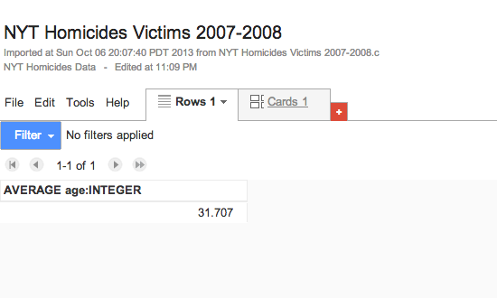
Let’s try a more complex summary. Let’s look at the average age of victim when grouped by sex. Go back to Tools and Summarize….
Look at the Summarize by dropdown menu and select sex. Then hit Save. You’ll see the data averaged on sex:
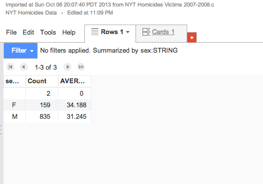
Besides the averages, you can also see that the gender of 2 victims was unknown, and the the vast majority of victims are male.
Let’s go back to the Summarize by option and Add another option: race
Now we have an even more complicated summary: the average age and count for every combination of sex and race:
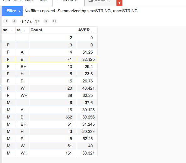
That’s the extent of the summary we can do with this data. Try summarizing by some of the other columns, such as the names. Since the group size of names is very small (usually, just 1), it’s not useful to average the age of victims by name or incident_id
Merging victims with incidents
The dates of the homicides nor their locations aren’t in this table, ostensibly because some incidents may have had more than one homicide associated with them.
The field names for this table are:
incident_id, sex, race, age, fname, lname
So let’s look at the incidents data for 2007-2008.
The field names for this table are:
lat, long, incident_date, incident_time, boro, num_victims, primary_motive, **id**, weapon, light_dark
That id field in the Incidents table is how we can join, or merge the Incidents and the Victims table together. In database terminology, we refer the incident_id in the Victims table as the foreign key. It allows us to join the victims data to “foreign” data, i.e. data in another table.
One strength that Google Fusion Tables has over your typical spreadsheet is the able to merge tables with appropriate foreign keys. So let’s merge the victims and incidents data, respectively, using incident_id and id
Merging the incidents with the victims
We can start from either table, but let’s perform the merge from the Incidents table.
- Open up the Incidents table
- Click File from the menubar and select Merge
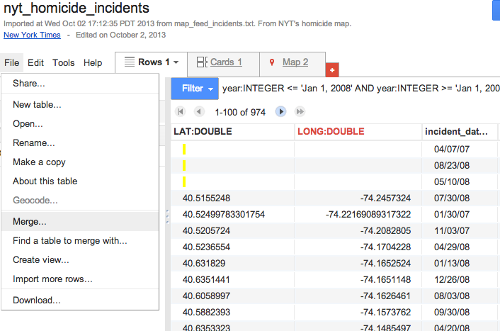
- A list of Fusion data tables will appear. Click on nyt_homicide_victims
- Google Fusion will then ask you to “Merge: Confirm source of match”. It wants to know which fields to use as the foreign key. Select
idfor “This table [incidents]” and selectincident_idfor the nyt_homicide_victims - The new merged table will consist of all the columns in both
victimsandincidents
One limitation of Fusion Tables is that you don’t have much freedom to manipulate the mashed-up results; for example, you can’t add new columns to the mashup table. So just export the data as CSV and re-import it to create a whole new Google Fusion Table.
Mapping the incidents + victims data
To get to the mapping stage, all you have to do is make sure that your Fusion Table data has some kind of geographical data fields in it. You can set the column type to Location to tell Google Fusion tables what to geocode.
Steps - In Fusion Tables, click the Map tab - Chart using Lat,Lng - Create colorations by age
Add perpetrators
- Export the Incidents and Victims into a combined spreadsheet
- Add some kind of perp id in Google Spreadsheets
- Import back into Fusion
- Merge the tables
- Map by found perpetrator
Restaurants
Let’s see what interesting insights can come from the class-sourced list of favorite restaurants and the city’s health department data.
Import CSV of Favorite Restaurants into Fusion Tables
- Go to the Google Drive home page
- Create a new Fusion Table
- Select the option From this computer and click the Choose file button
- Choose the CSV file you just saved and upload it.
Map and Summarize
As with the homicides data, we can summarize and map the favorite restaurants list a few ways. For example, we can find out who has the most pricey taste. Or, we can map restaurants by priciness or by the person they came from.
- Import into Google Fusion Tables
- Map by Lat/Long
Another data source: NYC-DOH
Now that we have a favorite list of restaurants, let’s see how up-to-health-code our choices are. This requires going to the NYC health department reports.
As you might expect, how we named the restaurants does not match the NYC official list. And the addresses might be different too
Making our own foreign key
To join the class restaurants list to the NYC DOH list, we need to come up with a foreign key. The NYC DOH restaurant list contains a field called camis, which we can use to merge with the inspections and violations data.
Creating foreign keys in Google Spreadsheets
- Make a copy of the NYC-DOH Restaurant Data
- Add a new column via a formula that concatenates the first 3 characters of the Restaurant name with its latitude and longitude.
- Download as… a CSV (Comma Separated Values) file
- Do the same for the class favorites list
Merging in Google Fusion Table
- Go back to the Google Drive home page
- Create a new Fusion Table
- Select the option From this computer and click the Choose file button
- Choose the CSV files you just saved and upload them
- Merge the NYC-DOH restaurants table and the class favorites table via the foreign key we created.
This gets us the camis field for our class favorites list. We can then use this to find out how healthy our favorite restaurants are.
Bestsellers
The New York Times has the most famous bestsellers list. But National Public Radio maintains its own list, curated from a select group of independent bookstores. Let’s see if there’s a big difference between the two lists.
Outer joins
When merging with Fusion Tables, we will often be joining two tables of unequal size.
Let’s say you wanted to compare the prices at MegaMart versus the CornerMart:
MegaMart’s inventory:
| Item | Price |
|---|---|
| Orange | $1.50 |
| Apple | $0.90 |
| Kiwi | $2.00 |
| Peach | $3.00 |
CornerMart’s inventory:
| Item | Price |
|---|---|
| Orange | $2.00 |
| Apple | $1.50 |
Joining MegaMart’s inventory to CornerMart’s, using Item as the foreign key will get us this:
| Item | MegaPrice | CornerPrice |
|---|---|---|
| Orange | $1.50 | $2.00 |
| Apple | $0.90 | $1.50 |
| Kiwi | $2.00 | - |
| Peach | $3.00 | - |
NPR’s lists contain 15 books each, whereas the NYT has 20 books for each list, so we can expect that the NPR table consists of fewer entries than the New York Times.
What happens when we join the New York Times listings to the NPR listings? Not all the NYT listed books will have a corresponding match on the NPR side.
Homework
Make three visualizations, summaries, or filtered lists and post them to the Web:
- NYC High School Data. The foreign key is pretty obvious across these tables.
- Using any of the datasets discussed in class.
- Using a dataset from the NYC Data site.
Read these articles for next class:
When Maps Shouldn’t be Maps, by Matt Ericson.
PowerPoint Does Rocket Science–and Better Techniques for Technical Reports by Edward Tufte